What Is The Best Font To Use For A Cv
These simple CV details could make or break your application.
We all know that presentation is key for a good CV a recruiter will start making judgements about you as soon as they glance at your document, before they’ve even read a word. Your job is to make it as easy as possible for them to evaluate your CV, and font plays a part in that. If an HR manager gives up because the text is too small, the words are too condensed on the page or you’ve chosen a hard-to-read typeface, you’ve fallen at the first hurdle.
If you want to figure out the best font and font size to use on your CV, we’re here to guide you.
Can I Use Bold Italics Or Underlines
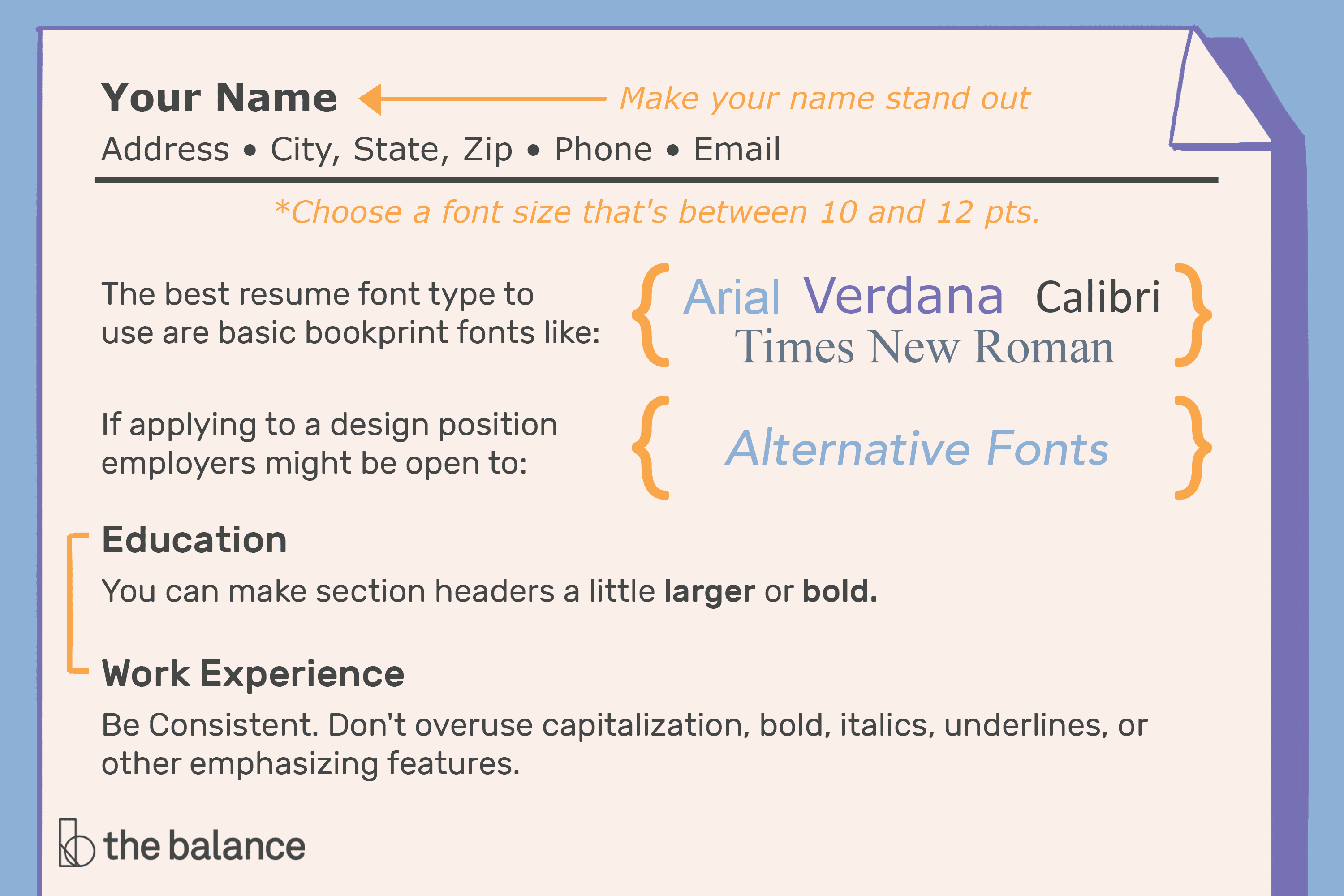
It’s absolutely fine to use bold and italics, but do so sparingly. Whilst they’re not appropriate for large chunks of text, you can use them for headers, to highlight key information and to quote, for example, titles of publications. Underlined text is not unheard of, but it tends to be associated with weblinks these days and is therefore best avoided if possible.
The Importance Of Legible Fonts On Your Resume
The font you select for your resume can impact your employers perception of you. Employers will look for something beyond your words, and having a well-selected font is one way you can express your professional presence.If it’s unreadable, it could be the first thing someone may notice and the reason why your resume gets skipped.Choosing a font that is clean, crisp, and well-defined can show the reader that you have style, are professional, and have a personal touch. If your resume is using a hard-to-read font, it tells the reader that you donât care about presentation or looking unprofessional.
A font that is too cluttered, too big, or too small makes it difficult for the hiring manager to read your resumeâand sends a message to them that you are disorganized, sloppy, or do not sweat the details.
While there is no perfect resume font, there are fonts that are better than others. It is important that you select a font that works for you and presents the best possible image for the type of resume you are creating.â
You May Like: What To Write In An Email When Sending A Resume Sample
Choosing The Right Resume Font Size
Readability is the biggest part of the font you choose for your resume. So while 1012 points works for most resume fonts, the truth is that each font varies.
To find a perfect balance:
If your resume exceeds a page by a few words or a sentence, try using synonyms or rewriting sentences to make them shorter. If you cant shorten your resume by rewriting it, try adjusting the margin and font sizes to fit a single page.
The Best Fonts And Size To Use On A Resume

Caitlin Proctor, CPRW
9 min read
Finding a job is tough these days, with steep competition and hundreds of applications per open job listing. You want every aspect of your resume and cover letter to convey that youâre the best fit for the job. After youâve considered your experience, skills, education, and qualifications, you have another choice to make: what is the best font to use for your resume?
Your resume font is one of those things that can either support your message or send the wrong message . In this article, weâll give you the 8 best fonts to use on your resume and how you can choose the right fit for your resume.
In addition to the best fonts, this post also includes these sections:
If you prefer, we have the same information in video format.
Recommended Reading: Do You Put Your Address On Your Resume
A Strong Resume Font Should Be:
Easy on the eyes
This means it doesn’t cause strain or confusion. Being “easy to read” is less subjective than it may seem.
In fact, once the internet became a thing, fonts were designed specifically for readability on computer screens, which is important to note because the majority of resumes are viewed at least initially on a computer screen.
Clear no matter what
Some fonts lose their cool when you switch to italic or seem more bubbly than bold. Make sure your resume font can hold its own no matter how you format it.
Others have symbols that can appear distorted, especially at smaller sizes.
Non-distracting
This is of utmost importance when choosing a resume font. When your resume lands in the hands of a hiring manager, you want your experience and skills to shine through, not the font.
Just like a glaring typo, a distracting resume font will take away from what you’re trying to sell yourself.
The Best Font For Your Cv
Remember that with resume fonts, the effect is subliminal. Focus on ones that will subtly impress rather than obviously detract.
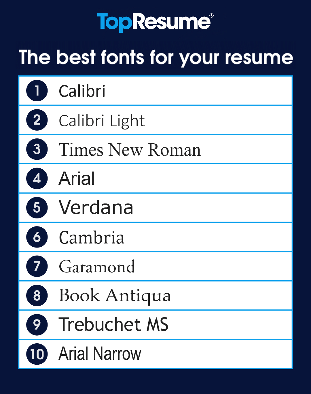
Here are the best fonts for resume writing see how they weigh in with your favourites:
Take a look at our resume tips page for more advice on how to write a resume.
Recommended Reading: Resume How To Show Promotion
What Is The Difference Between Serif And Sans Serif Fonts
The first decision you need to make is whether to use a serif or sans serif font. To clarify, a serif font has small decorative flourishes on its letters, whereas a sans-serif font doesn’t.
You can use either, but there are things to keep in mind about each style. Sans serif fonts are considered to be easier to read on a screen, which is where most people will first encounter your CV. They also ensure that the CV looks clean, contemporary and uncluttered.
However, if there’s a high chance of your CV being printed , a serif font may be the better choice. They can look dated, but they’re easier to read on paper and are generally preferred by the more traditional industries.
The Differences Between Font Families
Every font belongs to a family of fonts, which have similar characteristics and leave similar impressions. The first decision you have to make in terms of selecting a resume font is which font family is best for your goals.
These are the five broad categories that fonts fall into:
Serif: Serif fonts, like Times New Roman, belong to one of the largest and most common font families. Letters in serif fonts have decorative serifs, or little tails, on certain character strokes.
Sans Serif: Sans serif literally means without serif, so you can guess these typefaces dont havetails! Examples of sans serif typefaces include Arial and Helvetica. Sans serif typefaces have become highly popular in the digital marketplace, partly because of their less formal, more straightforward and minimalist look.
Monospace: Commonly associated with newspapers and typewriters, monospace fonts like Courier and Courier New were designed so that each letter would take up the same amount of space on a given line. Each letter is the same width. This allows for clean, consistent graphic design, as theres no size variability between the characters. Monospace fonts have also become a popular design choice in recent years because theyre a bit nostalgic, calling back to the days of typewriters and telegrams.
Whats The Best Font Option For Your Resume?
Recommended Reading: Uploading Cv To Indeed
What Is The Best Font To Use In A Resume
List of the best resume fontsTop 8 commonly used good resume fonts Top 5 situational resume fonts 6 worst fonts to use in your resume What category of fonts to use for a resume: serif or sans serif?Which fonts to use in a resume: summary of rules to followWhich fonts to NOT use in a resume The best font size for a resumeProfessional fonts in Word or other software
First of all, lets agree that informed sources often disagree on the best fonts to use in a resume.
Take Times New Roman, which some experts list as among the worst resume fonts. But others list it No. 1 among good resume fonts! What about Helvetica? Some deride it as an antiquated, overused font that you should erase from your type library. Others say its best by test a proven success!
What about serif vs. sans serif fonts? Some say sans serif fonts are easier to read, and some say the exact opposite. How do you make sense of the conflicting advice out there on this important resume formatdecision?
Bear in mind that the recommendations of font savants often come down to a matter of opinion. No matter how scholarly or heavily footnoted some articles on this topic are, at times its like reading about whether bananas taste better than apples.
However, there are certain indisputable principles that well explore here. Well also look at some of the fonts most commonly mentioned, pro or con, as well as recommended font sizes for resumes, and well look at why it matters.
How To Choose The Best Font For Your Resume
The two most important factors when selecting a font for your resume are readability and professionalism.
The last thing you want to do is to make a recruiter or employers life harder, so when building your resume, your font should always be straightforward and highly readable. They shouldnt have to squint to read overly light, thin fonts, or struggle to make out complex symbols or typefaces.
Professionalism, meanwhile, is all about tone. Just as we discussed in the previous section, even silent choices like font and formatting can convey tone as easily as your word choice. The tone of your font should match the tone of your workplace personality and your level of professionalism.
In terms of both readability and professionalism, there are a few broad font families that we commonly associate with the workplace and with professional settings. Lets go over each of the five main font families, or broad categories, from which you have to choose when youre writing your resume, cover letter, or references.
Read Also: Where To Put Publications On Resume
Ready To Take Your New Font And Write A Resume That Gets Results
Now that you know what font you’re going to use to convey your value, it’s time to make those updates!
Choosing a font is pretty straightforward, but understanding how to write your resume, what content to include, what format you should usethat can get confusing in a hurry.
If you want to understand the simple formula for writing resumes that actually get results, check out our complete guide: How To Write A Job-Winning Resume .
That will give you straightforward answers on what templates to use, how to format your resume, what sections to include, and how to get your value recognized. After you read through that, you should be ready to make those updates!
Head over to our free resume builder to create your resume using one of our proven templates. When you’re done with your resume, compare it to your target job description using ResyMatch.io, our free resume scanner tool!
Why Is Resume Font Important

The style of the font you choose for your resume is important because it impacts the readability and appearance. It gives your resume a professional appearance and helps you present a positive first impression to the hiring manager.
Choosing the right font ensures your resume is readable to applicant tracking system software. When you use a standard font, the likelihood of the hiring manager receiving your resume for review increases. When you fill out an application online, some ATS software can automatically scan your resume and populate the boxes for you. Using an easy-to-scan font makes it simple for the ATS to translate your resume to the application.
When choosing a resume font, consider the size, presentation and legibility on both paper and a computer screen. You’ll likely send your resume through an online link or email first and present a paper copy during an interview.
Don’t Miss: Listing Language Skills On Resume
How To Choose The Best Resume Font And Size
With thousands of fonts to choose from, it can be overwhelming to decide on the font that will leave the best impression on an employer and increase your chances of moving forward in the interview process. It may be tempting to choose a font that showcases your personality, but keep in mind that recruiters will be put-off if a font makes it harder for them to do their job of reading your resume.
Many employers also use software called an applicant tracking system to record and sort job applications. These programs dont always read and interpret intricate fonts well, so complicated or overly detailed font options can sometimes be turned into blank boxes or other illegible characters.
If youre creating a resume for a creative field like graphic design or advertising, you have more flexibility when it comes to style. Often, creative interviewers view the resume as a showcase of creative skills and abilities and is expected to be representative of your work. Even so, ensuring your resume is easy to read is a top priority.
Here, well go over some tips to help you choose the right font and size for your resume.
The Best Font Size And Style For Resumes
Theresa Chiechi / The Balance
When youre writing your resume, your font choice does matter. It’s important to opt for a basic fontchoose one that both hiring managers and applicant management systems can easily read. Your resume is no place to use difficult-to-read cursive, handwriting-style, or calligraphy fonts.
Don’t Miss: Cpr Certified On Resume
Welcome You’ve Got 10 Free Credits
Your free account comes with 10 credits. Credits can be used with any of our job search tools:
The number above shows the number of credits you have available.
Your free credits will refresh every 30 days.
If you want to learn more about credits and how they work, click here for more info.
If you want unlimited access to our tools, you can sign up for our unlimited plan below:
- These Are The Best Fonts For Your Resume In 2022
Confirming Your Font Choice
Hiring managers may read your resume on screen, but it’s also quite likely that they’ll print out a copy of your resume. So after you have selected a font and font size, it is always wise to print out a copy of your resume.
Take a look at your printed resume to see if it’s easy to scan through. If you have to squint to read, or find the font appears cramped, choose a different one or select a larger size.
Bottom line: You want anyone who sees your resume to be able to easily read it.
If you can read the document yourself, and you’re not using a novelty font , you’ve probably made a good choice.
Recommended Reading: Leadership Skills Examples For Resume
Formatting: What Is The Font Size To Use
Finally, moving forward from font style and thebest font for resumes, its time to delve into the formatting.
Just as important as the content and font of your resume, the size and spacing of your font are an integral part of your resume.
For starters, the color of your font should always be black unless exceptional circumstances demand otherwise. Stick with black.
Your resumes headings or headlines need to stand out, so the usual size of your headlines is 16pt classic.
The body of the content needs to be visibly smaller than the heading but not too small as it becomes harder to read with each point of size smaller. So the suggested size for the body of the content would be 12pt of the classic font.
Lastly, whether the font you use is one from the list above or something you prefer, make sure you stay consistent with the font throughout the document.
Resumes With Sans Serif Fonts
Most contemporary resumes use sans serif fonts, such as Arial or Futura, for a couple of reasons:
- They create a more stylized look and are generally more readable on a computer screen
- They give a sense of space, which can be interpreted as confidence on a page
- They tend to work better with newer, more stylized resume formats.
Recommended Reading: Conference Presentations On Resume
What Are The Best Resume Fonts 2022
Which are the best resume fonts 2022 in serif? Which is the best font for resume in sans serif?
Serif fonts are easier to read. The little brush strokes on each letter help our brain in faster reading.
But, sans-serifs are used as best resume fonts for their contemporary look. They integrate seamlessly with modern resume designs.
Resume Fonts & Sizes:

- The most common font to use is Times New Roman, in black and size 12 points.
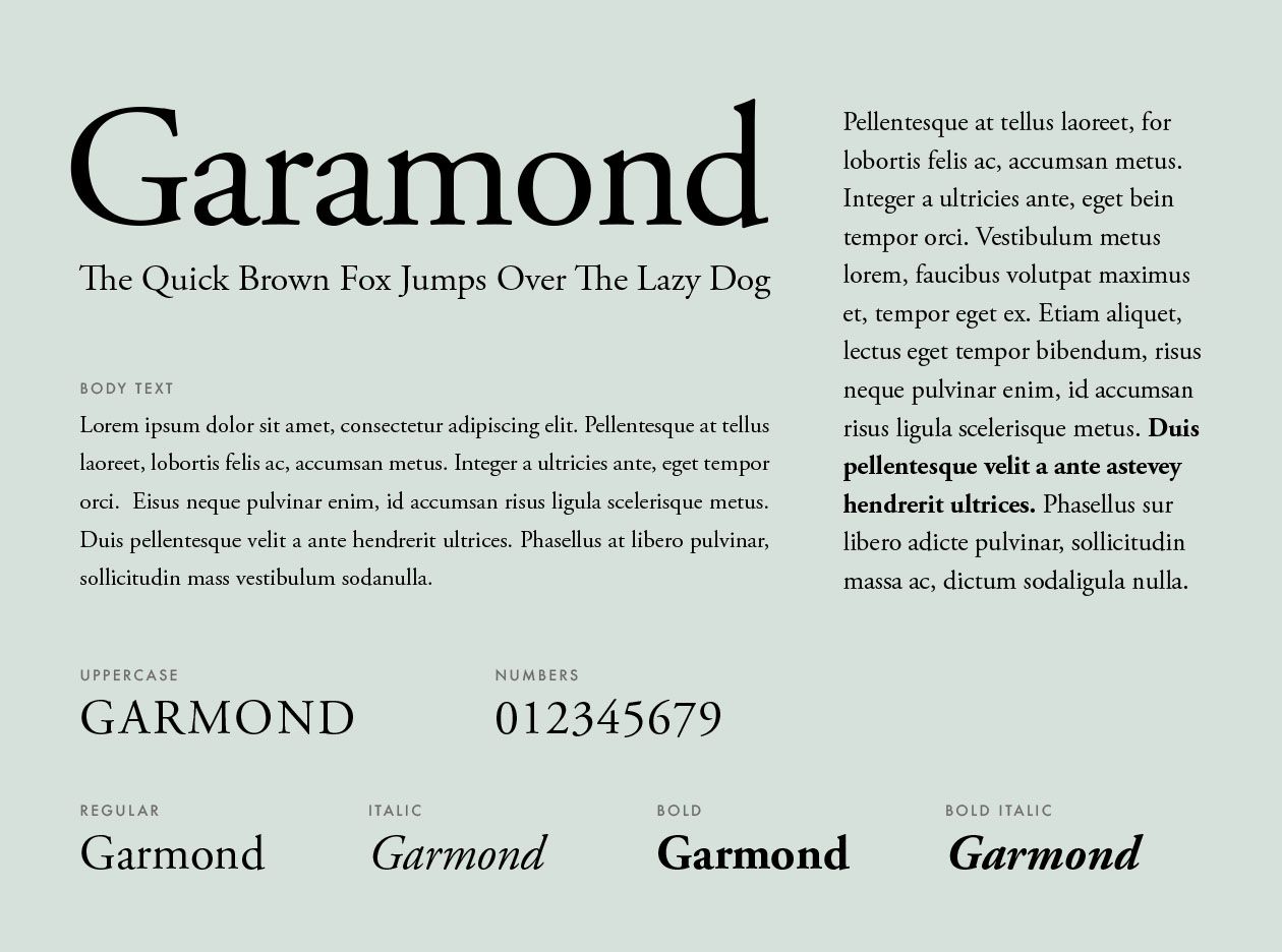
- Other serif fonts to consider that are easy to read include: Georgie, Bell MT, Goudy Old Style, Garamond.
- Popular sans serif fonts include Arial, Tahoma, Century Gothic, and Lucida Sans.
- Any of the above fonts would be reasonable for a resume as long as you consistently use one font only.
- Make your headings and name stand out, think of your resume like a blog post or newspaper article.
- Make headlines bold, Italicise, CAPITALISE, or underline. And feel free to increase the font size to 14-16 points.
- Try and keep your resume to one page, leave the reader wanting to know more.
You May Like: Devmyresume Review